With the help and advice of my 13-year-old grandson Collin, I created a new logo for Northern Light Media, and a new header for my business website, something I’ve been planning to do for some time. Those who’ve been with me for many years will know I’ve changed my logo and header for the website site many times, and it’s fun to look back over some of the old designs:
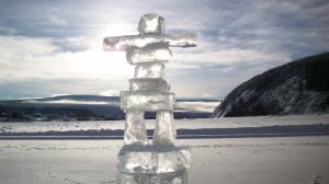
One of my first logos was based on this Inuksuk on the Yukon River at Dawson City, taken during the 2008 Yukon Quest. The sun behind the ice was part of the reason for using this photograph, and I wrote quite a bit at the time about why I chose to call my company Northern Light, as opposed to Northern Lights, and also why I avoided using the aurora in my logo, headers, etc. to avoid confusion. [Photo by Helen Hegener/Northern Light Media]
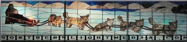
One of my first headers featuring the stained glass dog team. I have loved this 1910-era panel since finding it in 2007 while searching for something else, and I not only visited it in the Museum of History and Industry (MOHAI) in Seattle a couple of times, but I wrote a book about the search for its story and the history of Seattle, Alaska, the Arctic Club, and much more.

In 2014 I changed to this header. The blue font is called Beauty School Dropout, in part a reference to a song from the musical “Grease.”
I changed to this header in 2015, all my photos from my book, ‘The Beautiful Matanuska Valley.’
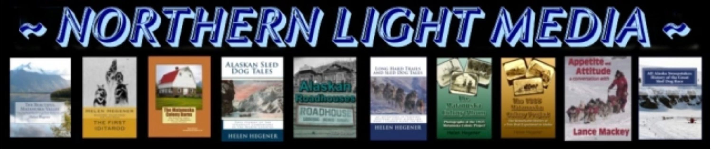
2016 was the first time I featured books on my website header.

In 2019 I kept it simple, but my business logo at the time was a compass rose.
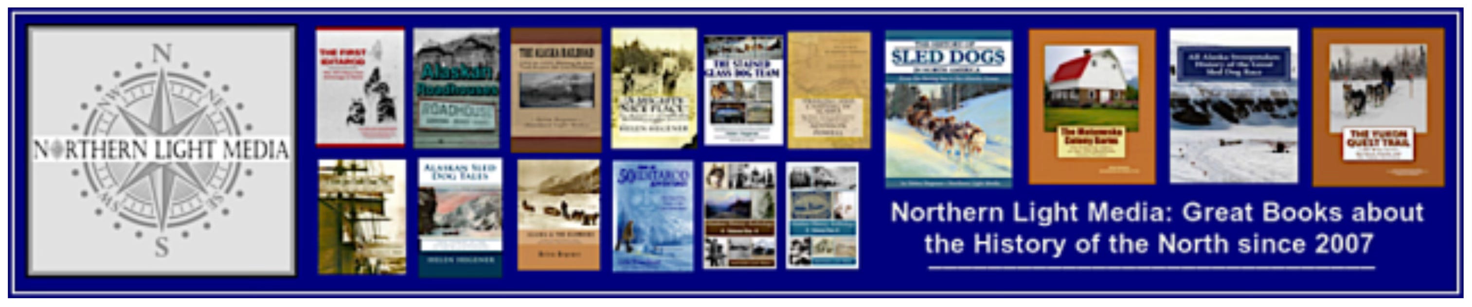
In 2023 I went back to book covers again.
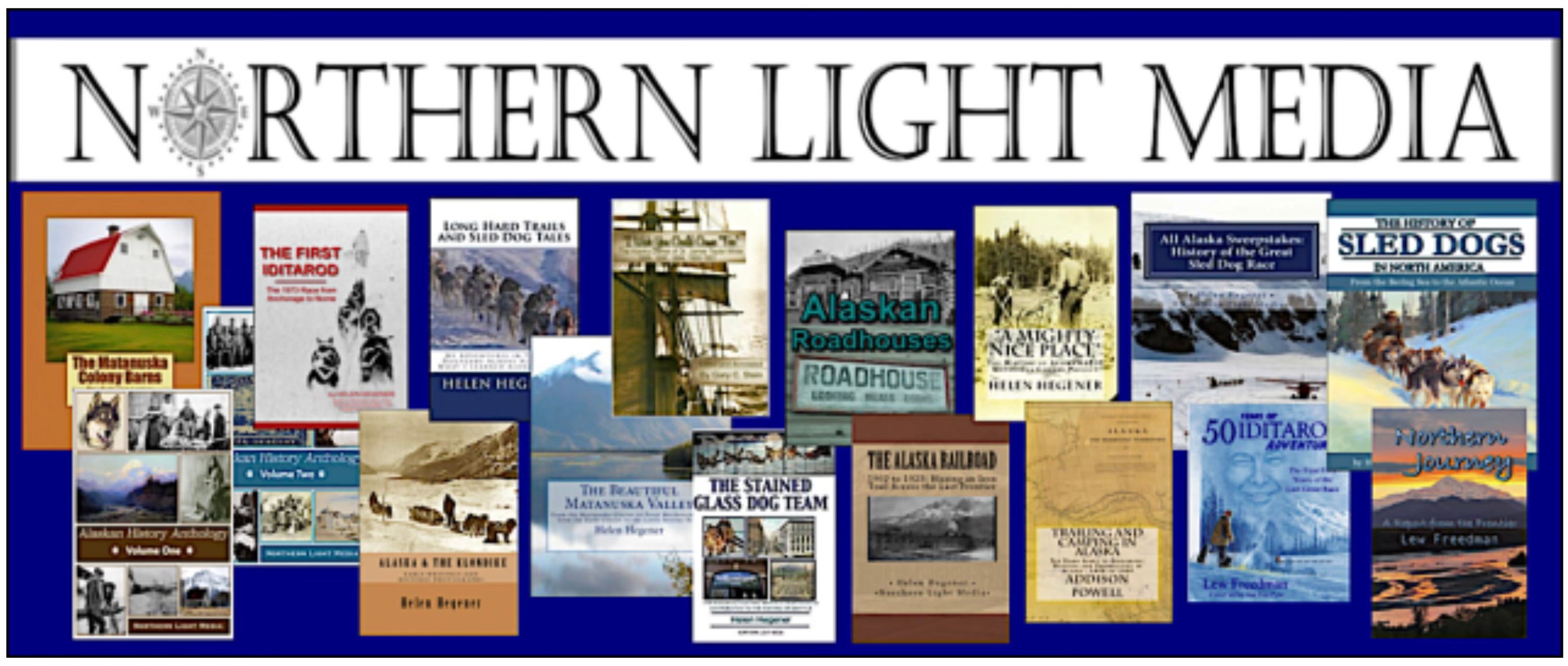
As I published more books the header grew larger and larger, and now with more than 30 books in print I decided to change back to a simpler header.
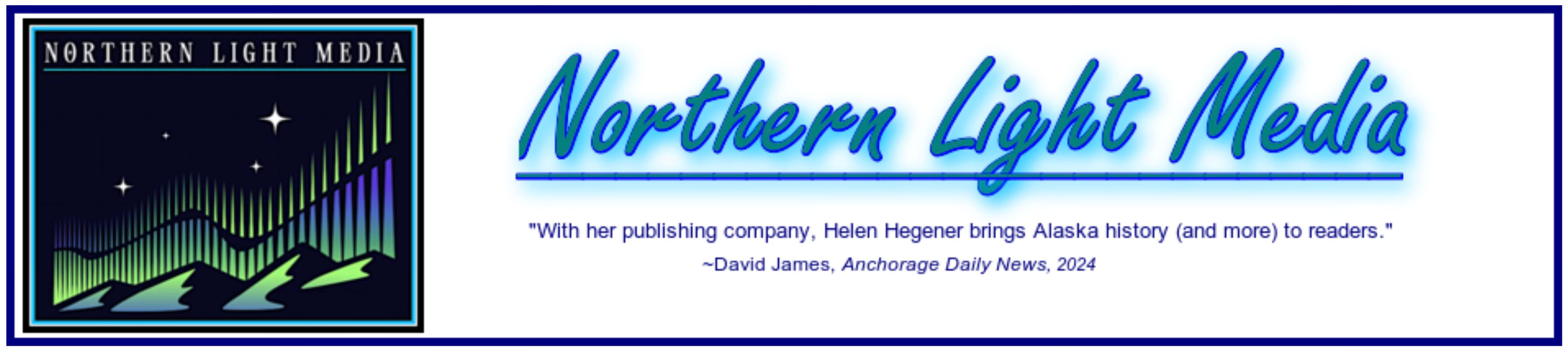
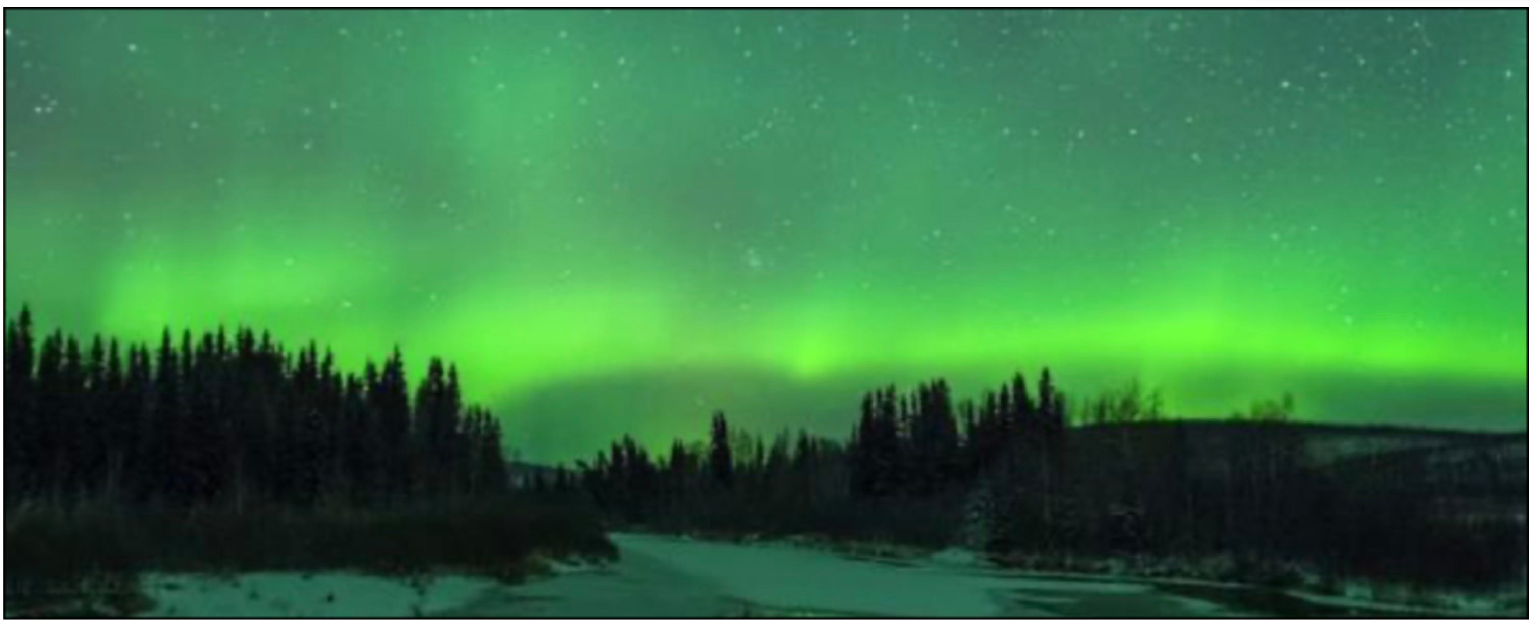
The new logo features those northern lights I’ve been avoiding for 18 years. I’m sure it will lead to misinterpretations of my company name, but doggoneit, I’m an Alaskan, my whole family is Alaskan, and the aurora is a large part of our lives, especially in winter.
My original thinking, and why I dropped the ‘s,’ was explained many years ago: “I chose the name ‘Northern Light’ for my company because, as a photographer and a sometimes-artist, I’m familiar with the properties of light, and I understand the innate beauty and preference for northern light.”
“Artists and photographers have recognized and understood the beauty and the benefits of light from a northern source for centuries. Northern light, also known as indirect or reflected light, produces cool tones and controlled shifts in light levels or values. These are important to artists and photographers, who work with colors, tones, contrasts, shadows, and other variables. With control over the light source which could otherwise produce washed out colors and stark shadowed areas, the subtle changes in colors, tones, and values have produced some of the greatest paintings, photographs, and artwork in history.”
“Artists such as the great seventeenth-century Dutch artist Johannes Vermeer, who was particularly renowned for his masterly treatment and use of light in his work, and was the original ‘painter of light,’ well known for the northern light illuminating his studio.
Photographers such as Ansel Adams, Alfred Steiglitz, and Edward Weston also recognized the qualities of indirect northern light, and many architectural elements, such as clerestory windows, are designed to take advantage of its diffuse nature. Northern Light is different, beautiful, sublime…”
But our beautiful northern lights (with the ‘s’) are perhaps the most sublime of all.